A dating app concept built around a simple idea: Who you end up with might not be entirely up to an algorithm. That’s Fayt.
Role: Creative Director, Art Director, UI Designer
Scope: Brand Identity, UX Flows, Visual Design, Figma Prototyping
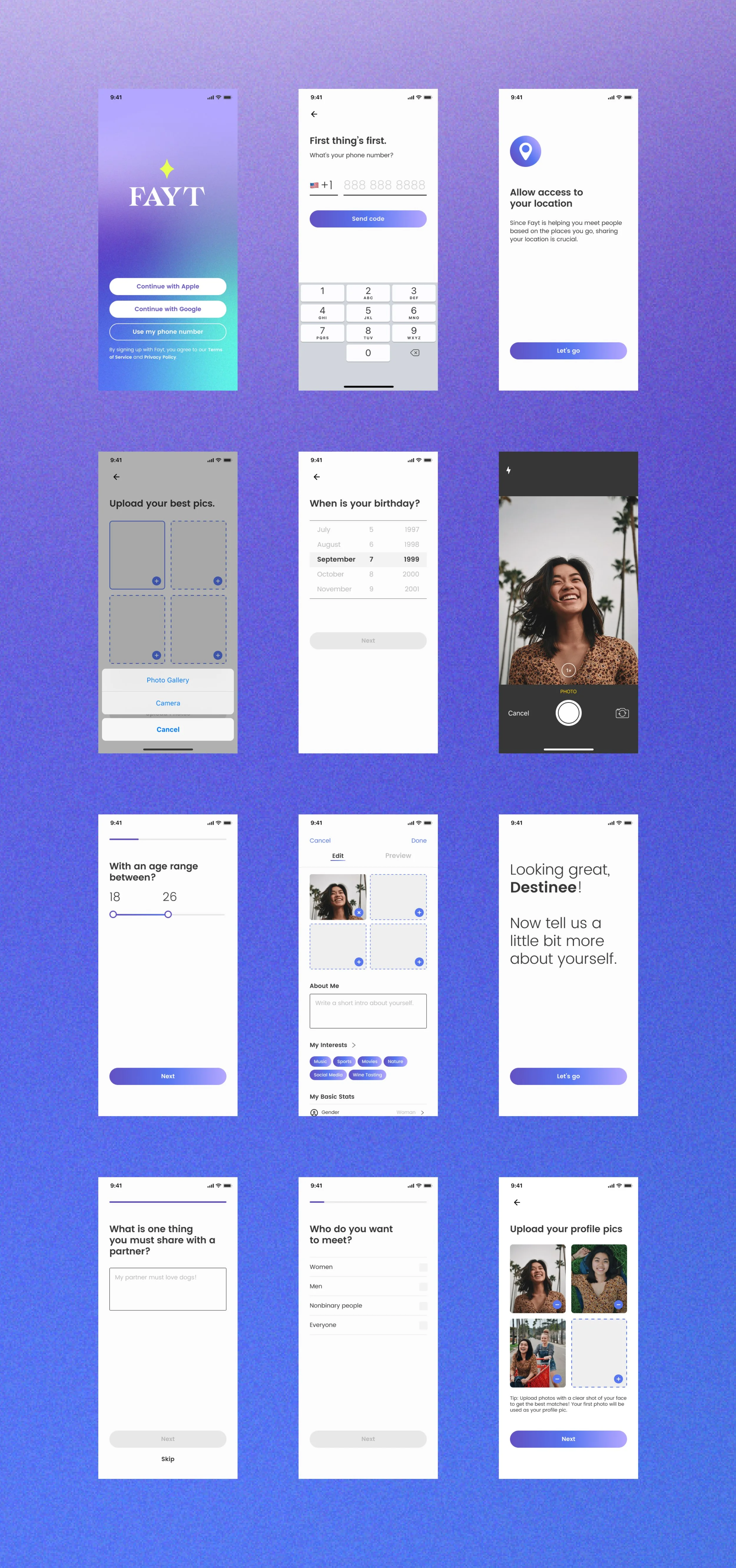
Deliverables: Full Onboarding PrototypeTHE CONCEPTFAYT is a stylized take on "fate", knowing you’ve found your person when you find that spark. This became the through-line for everything, from the logo to the last screen of onboarding.
Fayt came into being with a small cross-functional team — marketing, development, and design. Every creative decision: brand identity, visual language, and a complete iOS onboarding prototype, were all part of my scope for this project.
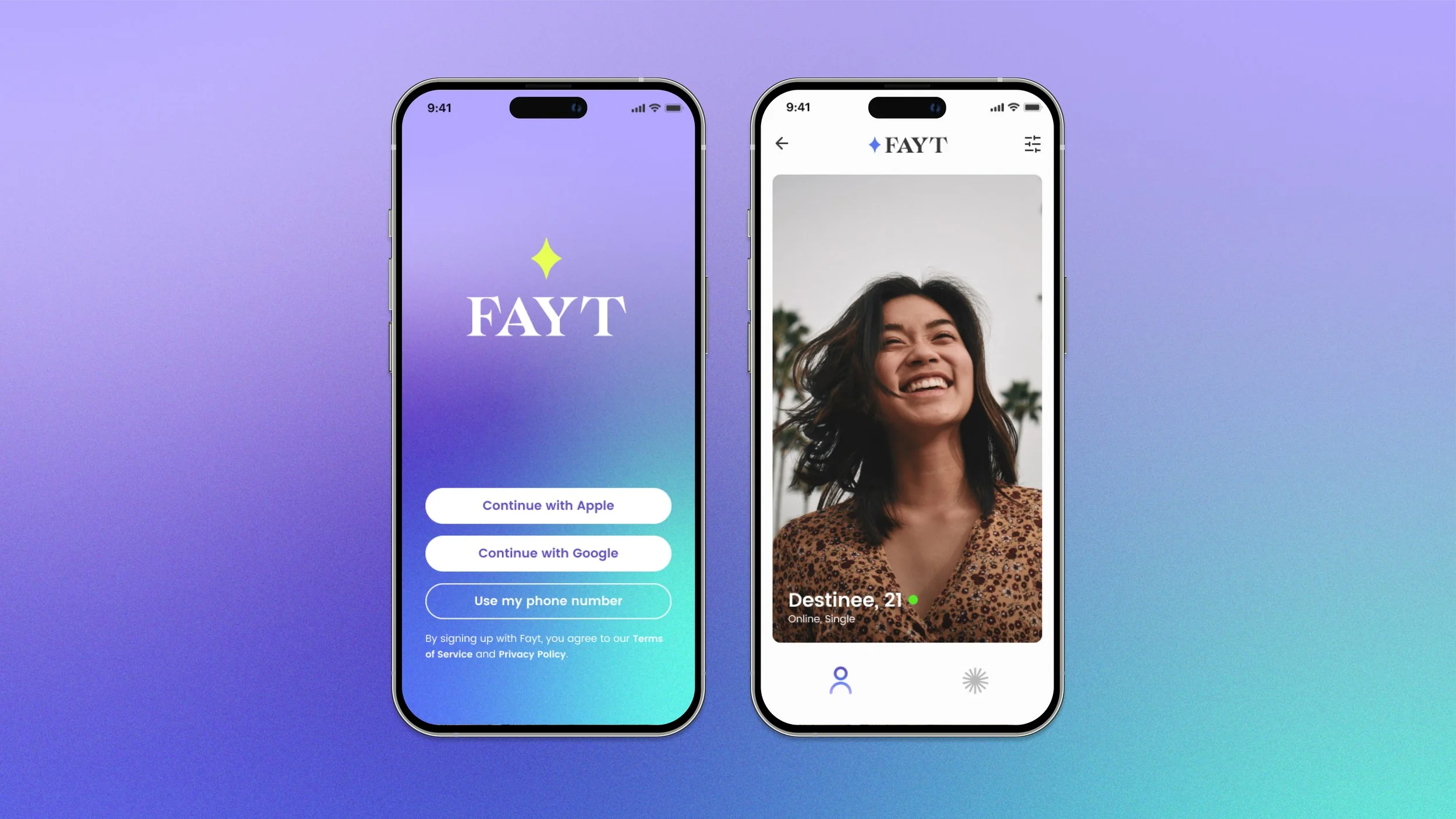
THE IDENTITY SYSTEMThe logo was kept simple paired with a stylized serif to set it apart from most dating apps that tend to use sans serifs.
The color palette was inspired by the varying gradients of a twilit sky. The purple-to-teal gradient sits in a register that's warm but electric, which felt on brand with the rush you feel when falling in love.
FINAL THOUGHTSFayt was built with a real team, toward a real product.
A sales executive brought the concept, a developer brought the infrastructure, marketing brought the strategy. I built everything, concept through prototype, with a team behind it pushing it forward.