Brand identity for an independent podcast company. Made for people who notice everything. Designed to make the small feel big.
Role: Designer, Full Ownership
Scope: Brand Identity, Art Direction
Deliverables: Logo system, Color & Type, Brand Guidelines
THE BRIEFOvertones needed a language and identity that would carry it into a room full of the Gimlets and Wonderys of the podcast world and hold its own.
The brief called for something that could resonate deeply with millennials of color who care about art, culture, and storytelling. A brand that has the quiet confidence to remain authentic.
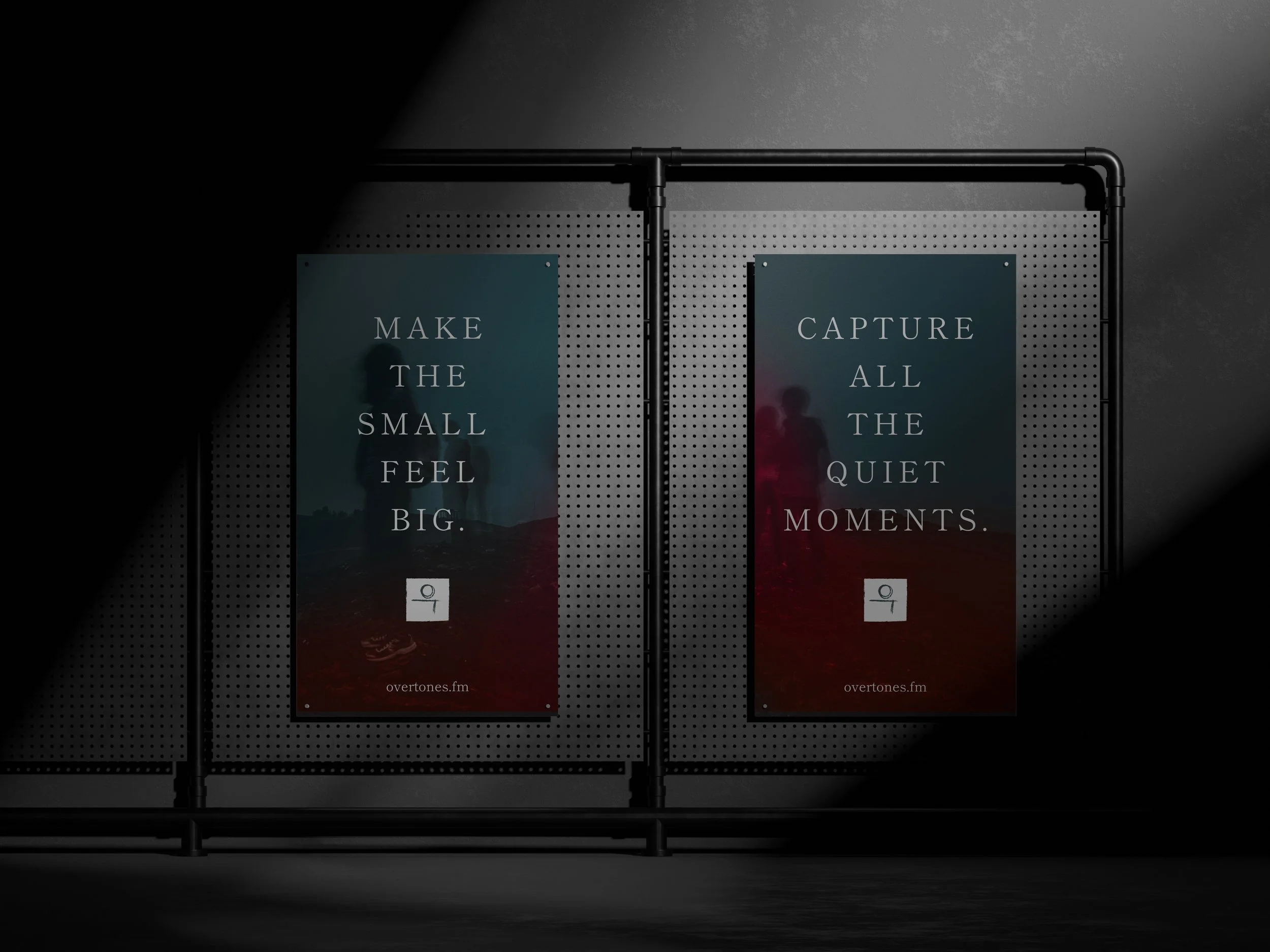
The goal was to “Make The Small Feel Big”. To broadcast all the small stories that people may miss, in the way that they were meant to be told.
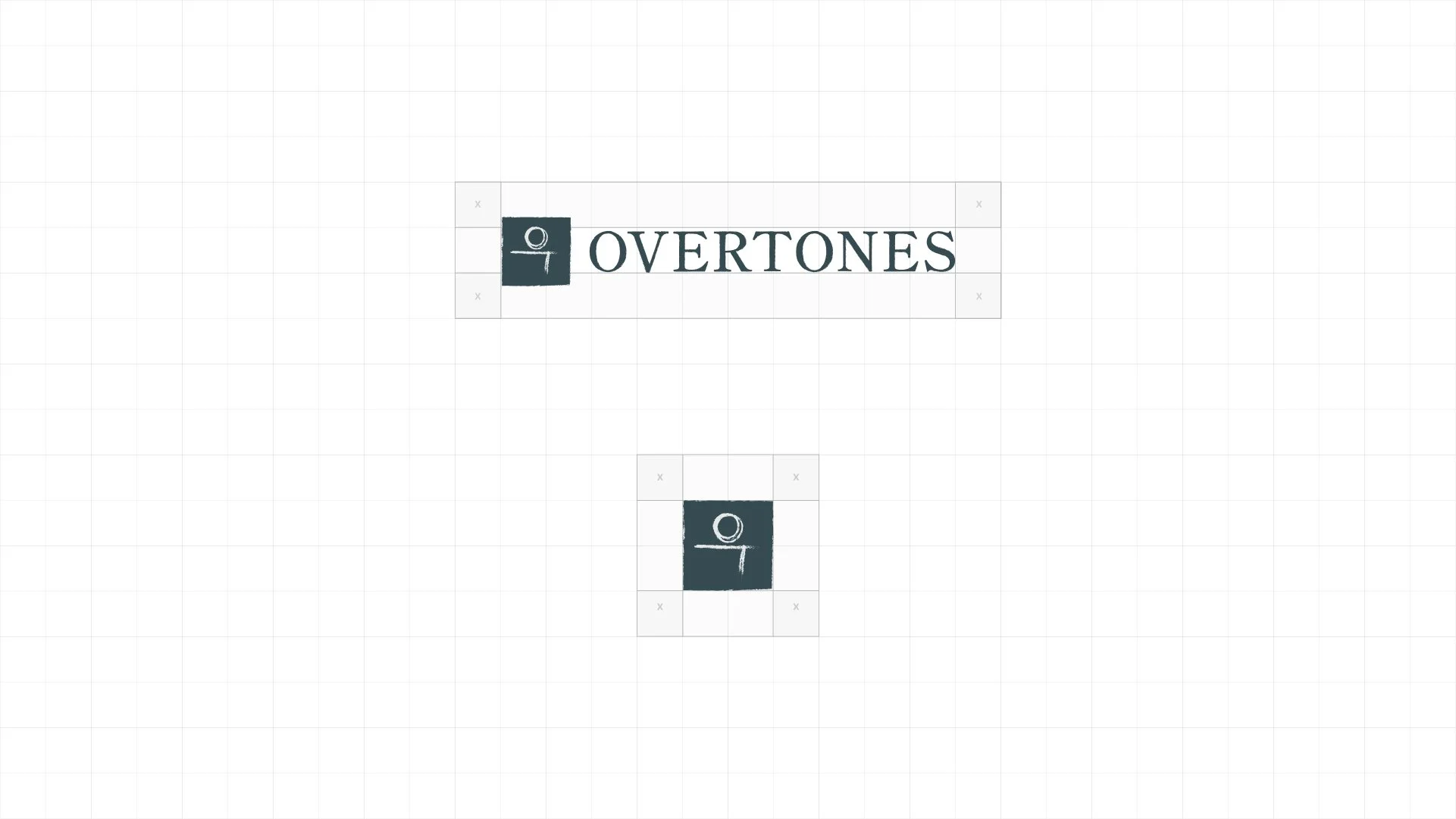

THE IDENTITY SYSTEMThe Overtones logomark draws from the Korean alphabet, Hangul, using stylized letterforms that look calligraphic, enclosed in a deliberately imperfect square. The result is a mark that feels both graphic and handmade. This carries over to the wordmark, with rough edges that you can see if you take a closer look.
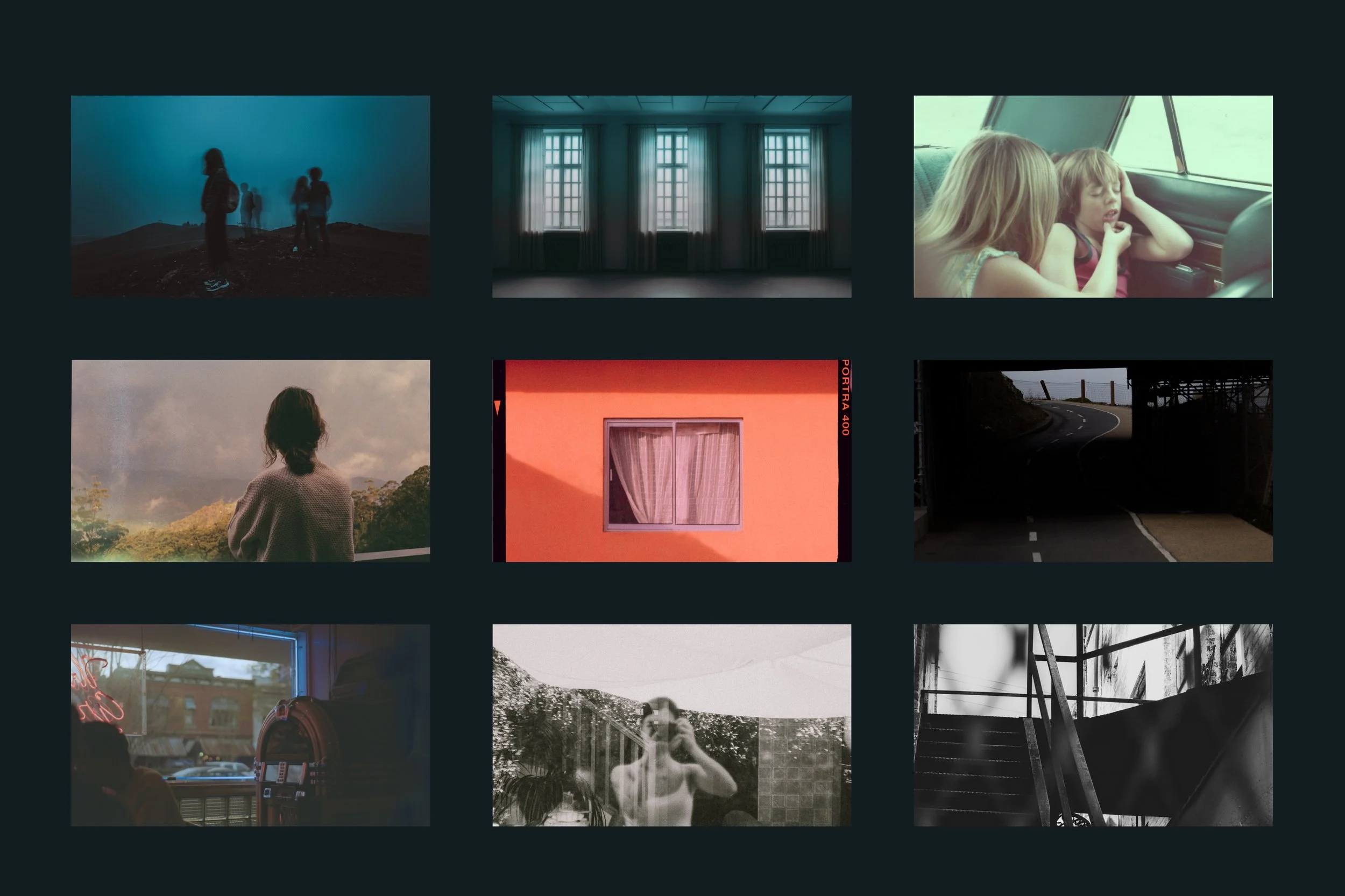
The color palette was built around the juxtaposition of a cool, sophisticated desaturated deep blue green, with a Coral that brings a warmth to the color system.
OUTCOMEThe Overtones brand identity was built entirely as a solo project: from strategy and research to identity design and guidelines documentation, all owned end-to-end.
The result is a brand system that can live across podcast cover art, social media, editorial content, and merchandise. It is built to be cohesive enough to be recognizable and flexible enough to grow.